")
Our RPL 100 year has been a huge success! We’ve shared our history as a library and our vision for the future with the Richmond community. The events, exhibits, and initiatives attached to our Centennial Celebration were exceptional.
As we move into our 101st year, and our organization’s next century, we have many great plans for growth. We are starting by launching a brand new look! We’ve developed new visual branding for our Library to include a new logo and color scheme. Here’s a little peek into how we got here…
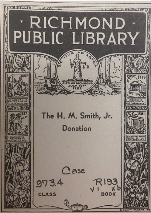 Bookplate
One of the first examples we can find of Richmond Public Library branding can be seen in this bookplate. It is an elegant etching that can be found in some of our oldest books. It exudes a classic feel typical of the time period. This particular book was donated by H.M. Smith, Jr. We still own a number of books that were donated from his personal collection.
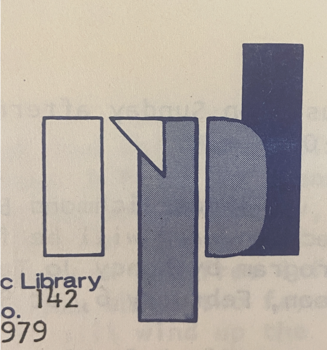 1970s Stencil
The next example we could find comes from the 1970s. As you can see, it is a stencil-style logo that may have been handmade. It is simple and geometric which would have been appealed to the aesthetic of that time. It is also the first time we see blue introduced to the branding.
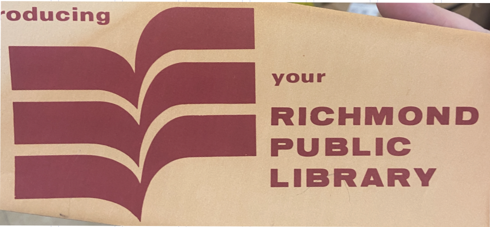 Letterhead of Unknown Origin
This logo was found as a letterhead although the origin and exact date are unknown. We were unable to locate any other examples of it but felt it was important to include as it is quite unique when compared to our other examples. Like its predecessor, it too is geometric in nature. The shapes appear to be open books which is the first time we see the logo include a library-related icon. It is also the first time we see red introduced as a color.
 1990s Stacked Logo
In the 1990s, we see a more familiar logo appear. This logo used our acronym in a stacked format, a look that you will see is used for many years to come. It also combines the blue and gold color palatte that remains with our branding today.
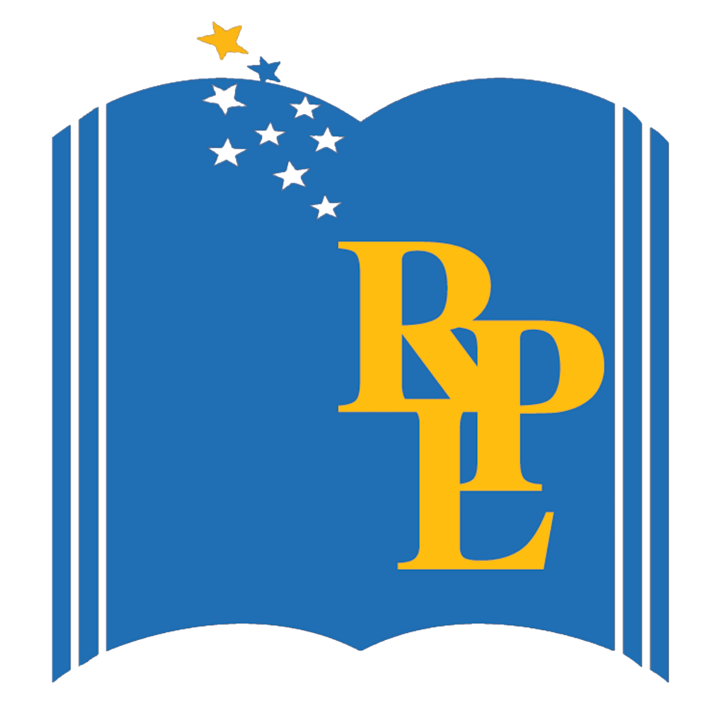 2000s Open Book with Stars
In the 2000s, we introduced the logo that would be used for the next 20+ years and that most of you will recognize. You’ll notice the stacked RPL remains with the addition of an open book image along with nine stars (that we believe represent each of our nine locations). The blue and yellow color palatte remains with a slight muting of the gold.
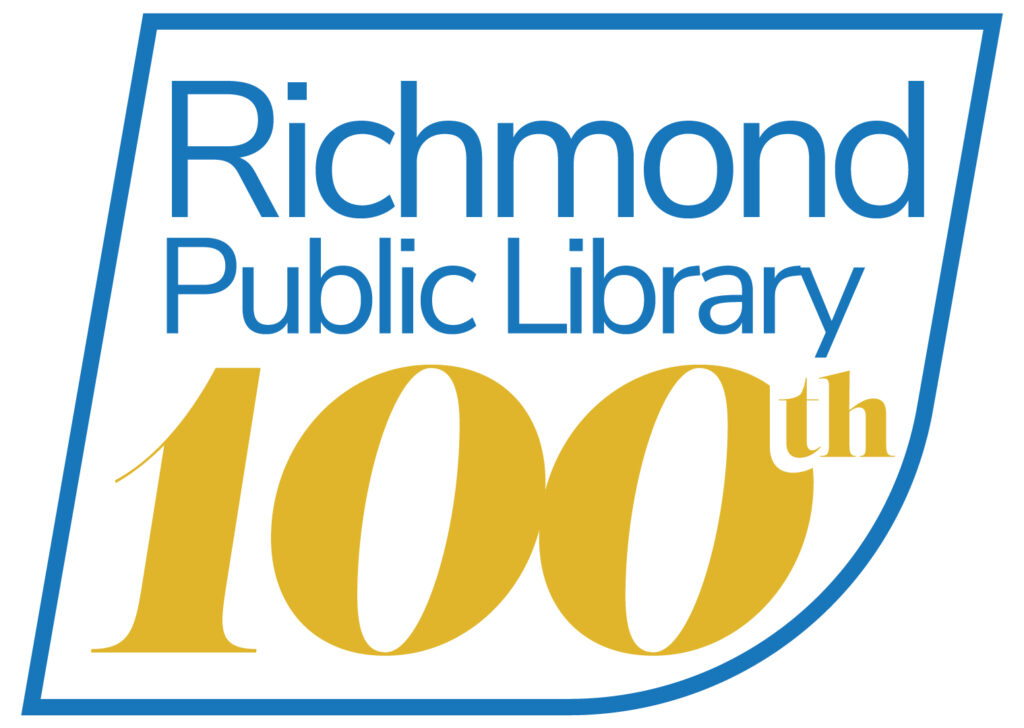 RPL 100 Centennial Celebration
In November of 2022 we launched our RPL 100 logo to commemorate our centennial year. We stuck with our classic blue and gold color palatte and introduced a new shape to the mix. Reminiscent of a book but with a more modern feel, this shape invokes the feeling of forward motion and our excitement for our next century.
2024 Visual Rebrand
Now, to officially introduce the new logo for our next century! The shape itself gives a nod to our historical logos in several ways. You’ll notice a similar box to the one used with the RPL 100 logo as well as an internal shape reminiscent of previous open books. We’ve kept the forward momentum that we loved in our RPL 100 logo and increased the prominence of the R to highlight the central role we play in our city. Finally, we decided to go with each of the words in our name stacked to emphasize the importance of each component. “Richmond” for our City. “Public” for those we serve. And “Library” for our roots, our purpose, and our identity. Below are examples of ways you’ll see our logo represented in the future.
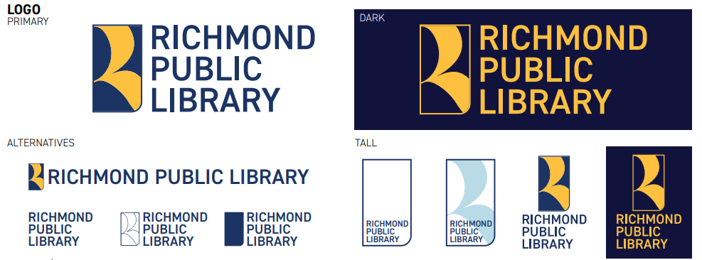
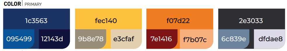
Finally, we’ve refreshed the color palette we’ll be using in our visual branding. We stuck with our beloved blue and gold, adjusting the hues just slightly to make them more modern and inviting. We’ve also added some additional colors to add flexibility and fun to our visual presentation. When used, the oranges and burgundy will allow us to lean warm and the grays will give us a cool and more formal feel.
We’ll be making the transition for most of our assets over the next few months; however some larger projects such as library signage may take longer. We appreciate your understanding throughout the process and hope you are as excited as we are for these changes! We hope you love our new look as much as we do! We are excited for this change and all the exciting new things that our new century brings.
